Top 10 MANAGAKA

Now you will see the best Mangaka by "Let's Draw and Color Manga". And you will see some critics ...Let's start with ...

Read More

The Best Software For Drawing And Coloring Manga

Hello As you know, most of our lessons centered on digital drawing and painting ... But did not mention what software should be dealt with ... Now ... I'll show you the most important programs, though they are many, but we will mention some of them ... Let Us!

Read More

Top 10 Computer Drawing Tablets

Are all tablet has the same capacity? Offer you today is different graphics tablet ... Various price ... And size

Read More

TEST4

Replace these every slide sentences with your featured post descriptions.Go to Blogger edit html and find these sentences.Now replace these with your own descriptions.This theme is Bloggerized by Lasantha - Premiumbloggertemplates.com.Download more free blogger templates from www.premiumbloggertemplates.com.

Read More

Featured Post 5 Title

Replace these every slide sentences with your featured post descriptions.Go to Blogger edit html and find these sentences.Now replace these with your own descriptions.This theme is Bloggerized by Lasantha - Premiumbloggertemplates.com.Download more free blogger templates from www.premiumbloggertemplates.com.

Read More

Join The Community

Search

Value Sketch with Gunzy Tutorial

INTRO:
So, you’re wanting to get the hang of value and contrast? Then you’ve come to (almost) the right place. It’s simple really, once you get the hang of it.
I myself neglected learning how to shade correctly for years in favor of increasing other skills instead. But I soon learned that value really adds depth to an object, and decided to pursue learning this on my own.

In short, after messing around a bit, I learned in near two days, just from experimentation (and being a fast learner). And now I pass on what I’ve learned to willing others. Let’s do this, F**K YEA!!

PART I – The Doodle

The doodle is the best way to start off, you need to have -something- visualized. Some people also do silhouettes to start them off, although all the detail isn’t yet in place, so that makes it hard unless you have a clear vision of everything.

I personally start off with a little sketch/doodle, all details already drawn in and ready to be filled up with value.

I’ll get to something cool later, but for right now, we start with the basics. And that means simple geometric shapes i.e. cubes, cones, spheres etc. I’ve doodled an example of those three.


PART II – Blocking In And Choosing Light Direction/Source

This is the part where I usually choose where the light is coming from. Two of the easiest ones to do are from behind, or from the side, but it’s best to practice with every direction you can.

First I block in with shades of gray, using a hard edged brush. The lighter the gray, the more light is hitting. When something is completely saturated with white, it’ll look mostly just white. This takes practice and some fiddling around.

Do this on a separate layer, and on top of the sketch, the lines are only there to hold the shape of the object. Mess with the opacity so that you can see the lines through the gray, but can also still tell your darks from your lights.

And don’t try to be so perfect in the stage, be as messy as you want, just keep a general idea in your head of where the light is hitting and you’ll be fine.


PART III – Cleaning Up, Giving Prescence

Ok, so now you have a really ugly looking shape with really ugly looking shading, which is overall really ugly looking. Right.
So now it’s time to make it a bit prettier.

Clean up the gray that falls outside the shape by erasing it. It doesn’t have to be too good, just good enough.
Next, make a new layer. This is where edges, midtones, lightest lights, and darkest darks get semi-defined.
Take a medium sized soft brush (low flow and low opacity if you’re using PhotoShop. I’m Using SketchBook Pro 2010) and go over the object lightly with either white or black. Depending on where your light is hitting, and where your shadows are.
Don’t go overboard with it.

I also forgot something *facepalms*. At this point, or even BEFORE this step, I usually lay down a soft gray background to contrast more with the light. So if you haven’t done this, do it on either the same layer, or a new one. If you do it on the same layer you’ll probably get a better result, as you can still go over the edges and define them even more.
I also do a soft shadow and some secret ninja stuff you’ll have to spot and try on your own.


PART IV – Detailing And Not Going Insane

And by this I’m mostly talking to myself…I’m a guy with a taste for detail, what can I say, I go crazy with the possibilities sometimes.
Anyway, for tutorials sake I’ll throw a few scrapes and cuts into the shapes.
I used this to teach myself how to get used to other things on the same object interacting with the same light…it’s complicated to explain, so I’ll draw it instead.

As you can see, by drawing little cracks all over the place, this gives you a chance to experience with how the light interacts and practice more, instead of redrawing the same object over and over and OVER. Although some may prefer to do that, all the same.
I’ve also worked some strange forbidden magic to make the results of mine look a bit better…hint: draw, blend, go over, blend, go over, wash, rinse, repeat.
Basically what I just said is in order to make the cracks blend in with the object instead of sticking out, I went over the area with a gray of the surrounding shade, and went over some areas once again, to keep it both blended, yet sharp. Get it?

Of course you don’t, this takes time.

I create a new layer, this will most likely be the final layer, but sometimes I add some extras.
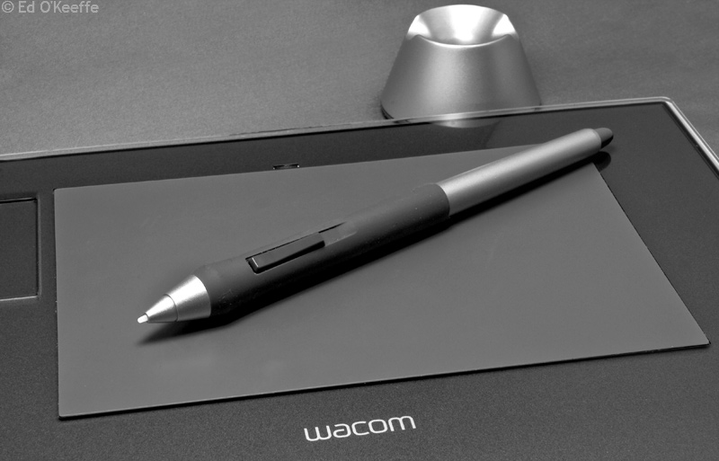
Right now, I work with a very small brush, if you’re not using a graphics tablet and don’t have pressure sensitivity on, well…this will be tough. You can skip this though.


PART V – And From Here

You’ll know when you’re finished. As an artist I’m sure you’ll keep going back and forth messing with stuff until it looks just right, and if you don’t do that…maybe you should.
Also, with the full grayscale drawing done, you don’t have to worry about too much when it comes to coloring. A nice combination of overlay, multiply or color layers should do the job. Experiment.

At this time, you can choose to either keep or delete your sketch layer. Why? Because amazingly, nearly no lines were used, WOOT! Because that increases the realism, although for style, I sometimes outline my stuff with a bright white outline.
It’s whatever you want.

And here’s that something cool I promised…cba, didn’t finish, whatever.


Protip I learned from Cype and Rei: Go from dark to light, not light to dark. Unless you’re that awesome.

Article source : www.mangatutorials.com/2011/value-sketch-with-gunzy-tutorial

Ripping Palettes for Better Colors

This process extracts the color scheme from an existing work of art and arranges the colors into an organized palette image. Use this resulting image like a painter’s palette to choose colors for your own artwork or game assets.

* In this guide I used Photoshop, but you can do this in any decent graphics program like GIMP or IrfanView, etc.
* This tutorial is explicitly verbose even though the process takes just 15-30 seconds.

Examples Of This Technique In Use

Artwork by Jeff Soto + ripped palette:

Artwork by Sparth + ripped palette:

Artwork by Sheperd Fairey + ripped palette:

Ripping Palettes – Step 1

Load a source image with nice colors from which to extract the colorset.
In this case I used one of my own digital artworks.

Tip: For best results use a gorgeous work of art with a nice color scheme rather than a photograph. A photograph typically has too many colors and may yield a less useful palette.


Ripping Palettes – Step 2

Reduce the # of colors in the image by converting it to indexed color (like making a GIF!)

In Photoshop, go to Image > Mode > Indexed Color. Choose Palette: Local Selective, Peceptual, or Adaptive. Reduce the colors as low as you can go without losing any vital colors in the image.

In IrfanView, go to Image > Decrease Color Depth. Choose “custom” and try 32 colors as a starting point, going up or down as needed to avoid losing any vital colors. Then go to Image > Palette > Export Palette to save the palette which you’ll need in step 4.

* I typically use between 24 and 64 colors – use as few as possible without losing the overall color scheme of the image.


Ripping Palettes – Step 3

Load this rainbow colored palette_base.PNG image into Photoshop or IrfanView.
 (You can right-click on this image right now to save it.)


Ripping Palettes – Step 4

Apply the reduced color palette we created in Step 2 to the palette_base.PNG, resulting in a neatly organized image that looks like (and will function as) a sort of painter’s palette.

Photoshop remembers the palette you created in Step 2, so simply go to Image > Mode > Indexed Color > Palette: Previous

In IrfanView, go to Image > Palette > Import Palette and load the palette you saved in Step 2.


Ripping Palettes – Step 5

Notice the pleasing color scheme in the resulting colorset palette image. You now have an artful palette full of easily selectable harmonious colors for your own artwork or game assets.

TIP: While this colorset could be your final colors, it also works well as a starting point. If your resulting palette is too limited, you can liven up your creation with some additional spots & dashes of color that don’t exist in the colorset. Be careful, though: A good work of art rarely has a huge rainbow of colors. Most great color schemes are based on just two or three major colors at most, using just accents of other colors for enhanced interest.

TIP: Try experimenting with the resulting painter’s palette image to make it unique. Change its color with the hue/saturation tool or try adjusting it with Photoshop’s Color Balance. This can make your palette more “original”, perhaps evolving it into a set of colors that no longer resembles the source image if you prefer.


Morality vs. “Other People’s Colors”

Don’t worry too much about “color theft.” If you run this process on enough images you’ll notice a lot of repetition because there is no such thing as a truly original color scheme. Also, it’s more about how you use the colors than the colors themselves. Your resulting image will only resemble the source image if you want it to look similar.

When I use this technique my work ends up different enough that no one could ever identify the source from which I acquired the starting palette. The reduced color palette is primarily useful to ensure your selected colors fit together into a harmonious color scheme. This technique is a great way to avoid the “out of control” color you often see in art created by people without a good understanding of color theory.

Advanced Palette Ripping Techniques

1. Did your source image lose some critical colors during the automatic color reduction in Step 2? Here’s an easy fix: Convert your resulting painter’s palette image back to 24bit. With the pencil tool (no antialiasing!) simply add a scribble of each color you want to bring back to the palette. Now run the exact same process as before, except this time use your modified painter’s palette as the source image (the one you scribbled on!), and in the palettization options use Image > Mode > Indexed Color > Palette: EXACT. (Once you apply that colorset to the palette_base.PNG it will neatly re-organize your added colors into a new painter’s palette image.)

2. The quality of your resulting palette will only be as good as the quality of colors in the source image. You can’t use a bad photograph of a painting, for example, because the camera will decontrast and ruin the source colors. Palettes are best sourced from digital artworks or professional quality photos of art. (Also – you can try digitally correcting the colors in the source photograph before running the process if it’s of decent enough quality.)

3. For enhanced results, you can apply image adjustments and filters to the source image prior to extracting the palette. There’s a lot of power with this! Imagine finding an image that has almost the colors you want in your palette. Digitally adjust it until the source image has the color look you want and then use it as a source image to extract the palette. Also, some images greatly benefit from using Photoshop’s Filter > Artistic > Cutout or Filter > Pixelate > Mosaic before extracting the palette. In fact, the Mosaic filter is particularly useful when using a JPG with lossy compression artifacts as a source image.

4. For a wider variation in colors, use the full 256 colors when first converting your source image from 24bit to Indexed Color. Then re-palettize the resulting painter’s palette image with fewer colors until it has a useful amount of banding for easy color selection.
5. Try bypassing the use of other people’s colors by creating your own source image from scratch. Try scribbling together your own set of colors and using that for your source image. Make sure you blend various color combinations so the between-colors are present in your resulting painter’s palette image. (Also, try running Filter > Artistic > Cutout on your scribble before using it as a source image. That filter can help pull your scribbled colors into a more balanced palette, meaning your scribble-source-image will produce a higher quality painter’s palette image.)

6. You can force Photoshop to include colors from a separately-saved palette during the color indexing process in Step 2 if needed. (Helpful for certain situations like if you need to force certain UI colors, or mix palettes together, etc.)

7. I recommend archiving a library of your favorite painter’s palette images for easy access to your most useful color schemes.

8. Even though good artwork typically produces the most useful palettes, you can get interesting results from photographs and other sources. Try running this process on packages of candy or cereal boxes – anything with good design and/or colors. Game screenshots can have useful results, particularly with “pixel art” like you find in cell phone games or on the Nintendo DSi. Photos can work if they are particularly artful and have a somewhat limited color scheme.

9. If needed, use Photoshop’s Filter > Other > Offset to quickly arrange the colors in your painter’s palette image into a more useful layout. This is particularly useful when you have a simple color scheme where the resulting painter’s palette image almost look like a mirror image. In that case, just offset the pixels horizontally (with “wrap around” enabled) by about 64-80 pixels.
Tutorial by Junkyard Sam. All rights reserved. Junkyard Sam is an indie developer and runs Stolen Goose. Ripping Palette for Colors was originally posted in Junkyard Sam’s blog here in October 2, 2009.

Article source : www.mangatutorials.com/2011/ripping-palettes-for-better-colors

Model Painting

The Basics

Painting can be as fun as it is easy once you get the hang of it. I my self like to paint models. In this tutorial I will attempt to teach you some things for painting your own custom models.

Part I
 
Painting Your First Model

Models can be expensive now a days! They range any were from 10- 50 US dollars for a good one. But I suggest you buy the 15-30 dollar ones to practice on. You’ll also need:
-Palate
-Water pot
-Primer (Spray paint)
-Super glue
-Acrylic Paints
-Brushes, 0 is a good standard brush, 0/3 is good for fine details
-Good working space
-Ink
-This putty stuff (I don’t know the name) that lets you fill in gaps.
-It helps to be able to read and have at least some way of seeing.

Painting Snap Together and/or Plastic Models

SKIP THESE STEP IF YOUR MODEL IS A GUNDAM OR A SNAP TOGETHER THAT IS ALL READY PAINTED!

As you see, your model is (I hope) all ready put to gather and has a base color. But This Plastic will NOT let your paints stick probably making them peel off and fade easily. But we can fix this! That’s what the Primer is for. First decide what kind of colors you want to use. If there mostly light then
take out a white primer, if there mostly dark use a black primer, and if your not really sure (I don’t recommend it) get a gray primer. Then spray it all over the model covering 100% of it. Spray in
Bursts and NOT in a long blast because it will waste the paint inside it. Then wait about 20 min and come back and do another coat for a total of 2. If you missed any spots you can go over it with that color paint. Still with me?
This is the easiest part.

Good, now you need to decide what color you want to use as the base color. For my marine I used a dark green. Once you’ve decided on that, take that color get some on your brush, dip it on your palliate. What you’ve just done is know as thinning your paint, never use it strait out of the jar because it will be to thick and wont come out nice and smooth, more like clumpy and nasty. Cover the hole model except the gun and face. Still with me? Good. Wait for the paint to dry (if you have it under a fan it will dry quicker) and lets go on to the next step…

OK YOU LAZY PRE-PAINTED PEOPLE, YOU CAN READ FROM HERE ON!

Ok, good now that you have your paints (for all you other people who are just reading, look at the colors of your model and get the acrylic equivalent paints, i.e. if there’s red get red paint) Now make sure you thin out your paint (Dip your brush in the paint, the strait in the jar of water and then
on the palate, if its still thick, dip the brush in the paint and back on the palate) and paint all the parts over with the right colors and remember, be neat!

Well that’s it! Your done with the basics! If you have a pewter (metal) model fallow all the steps but make sure you clean your model for Flash (lines left from the casting) and other parts that don’t belong there. And make sure you give your model a bath! That’s right, a bath. Scrub it with soap and water and rinse it before you prime it, this will take off any flash and mold on the pewter piece.

In the next section I’ll talk about advanced things you can try. I hope to get a digital camera in May so I can take pictures for you!

Part II
 
Just a some terms you should be familiar with before you move on to the next tutorial…

Glossary

Drybrushing
Load your brush with paint, wipe most of it off on a damp rag so that only a few pigments is left on the brush. Then quickly but gently brush across the desired areas. Notice how these few pigments stick to the miniature and create a kind of highlighting effect. This technique is good on hair, hands, armor of all kinds, and especially weapons. 

Wash
Washing is what you do when you water down the base colour, or a darker shade of it and apply it on top of the base colour. The mix must be thin enough to flow down the recesses of the miniature and leave the base colour shining through on the raised areas. If you’re feeling advanced at this stage you can use ink instead of watered down paint for this procedure. Any art shop should have a good selection of inks in different colours. The most useful however are red, green, yellow, brown, black (for black lining, covered later) and blue. Inks flows smoother into recesses and leaves a more shiny result than watered down paint. 

Highlighting
Highlighting is a technique that requires some practice to master. It’s important to have the correct amount of paint on the brush, if it’s too much you’ll get a somewhat dry and powdery effect, if the paint is allowed to dry too much before the procedure is finished it will look dry and crisp also. I usually water it down a little bit, not as much as when you make a wash, just half a brush full or so for 6-7 brush full of paint (A brush full is my term for dipping the brush in the paint pot and putting it on my mixing plate instead). I then take _very_ little paint on the brush, sometimes even wiping it off on a rag, and brush ALONG the raised areas, not across them as you do when you dry brush. This way the paint doesn’t dry as quickly and it’s easy to erase any mistake you do with the highlight by brushing the fresh paint off with a damp brush.

Black lining
As miniatures only are 25 or so mm high, light does not create shadows on them as on normal clothing. I and many with me use black lining to create a contrast between different parts of the miniature which creates the illusion of heavier shadow on these areas. Paint a thin black/red/brown line between all areas on the miniature, the beard and tunic, the sword blade and handle etc. I use black ink for this procedure as it flows better and it’s easier to make thin straight lines. I recommend it for all who wants to be serious about this.
- full credit is given to the actual author(s) of this section.

Now, on to the tutorial!

TAKE OUT THAT MODEL YOU JUST FINISHED WITH THE OTHER TUTORIAL AND KEEP ON READING!

Deciding What to Do

Ok, you’ve painted your model but there’s something missing… or is there? At this point you need to decide if you really -want- to use these advanced skills. This is because it’s very easy to make a small mistake and mess up the whole model. Also I use  a specific brand of paints, there called -Citadel- paints, the war hammer people. I use their painted because they’re the best (IMO) and I like the names of the paints :). Ok well you’ve been warned here’s what you’ll need:

For dry brushing (it’s another form of highlighting):
-A worn brush or a brush that you don’t mind getting messed up.
-A lighter paint color (lighter then what your dry brushing) for your dry brush.

For highlighting:
-A lighter color of your base coat (table below).
-A fine and -very- strait brush for precision highlighting (my name for it).

Shading:
-A darker ink of your selected color (below).

What Paint to Use for Different Colors and a Little Info on Why

Black, Red, and Blue highlights. Use gray or white for a standard highlight. Use a metallic gold for a royal looking soldier or metallic for rusty highlights.

Green highlights. Use a lighter shade of green or yellow of a normal highlight.
Gray highlights. Use a dull white or bright gray.
White, guess what! You don’t need to highlight a white model because white is the brightest color in the color table!

Shading

Not a whole lot to this, just get the same color of your base coat but get it in an ink and a shade darker. For white you can use a dark blue, and for red use brown.

Ok, now take out the model you just finished base coating. That’s all you did, base coat the colors on it. But now were going to have some fun. Get a darker color of you base coat. And PLEASE remember (and I’ll cap’s it)…

FOR EVERY COLOR ON THE MODEL HAVE AN INK TO SHADE IT WITH AND A LIGHTER COLOR TO HIGHLIGHT IT!!!

I can’t even begin to tell you how many people don’t remember this rule. When you shade only shade the color that it was meant to get shaded. For example, after you’ve shaded red with a brown color.

Part III
 
Few things are as rewarding as having a finished, inked and or CG enhanced drawing. One of these is having a High Lighted, shaded, and very well detailed model. When I first tried these things they were not easy and were not called advanced skills for nothing. For the first few times you try its going to be hard but I’ll try and explain it as best as I can. Please try and visualize what I’m talking about because it will make it a lot easier for you to understand.

Painting Tips
(I got from all over the web, friends, and my own tips)


What are the steps to painting a good model?

You spray them black, then you ‘wash’ which means use watered down paint (most of the times it refers to ink though). You wash “Dark Angels green” all over the model then wipe off brush and absorb paint from the detail. After it dries (in less than a minute) you’ll have green tinted black then you dry brush which is dipping a brush in paint then wiping most off in a lighter green like “snot green”. Then you let that dry then you ‘highlight which is taking a color like ‘bleached bone’ wiping  it off the brush so there is only a residue and then going over any texture with that.

1) Primer; which one is best?

There are two ways of painting: the first one I learned I suggest to you as a newbie which is black primer as this allows you to add realistic shadows, color tones, and metals.

2) Shading. Washes, and highlights… how do you apply them and when should you use them?

Models take a lot of steps to look like they do on the front of the box. A model that is red for example requires several shades of red.  The first stage I call the wash you take the paint brush and dip the tip in water after the paint is on it, slop it all over the model, then make sure to soak it up from the detail (don’t want it to fill in the cracks).

Shading is basically building up colors; i.e. starting with a dark color; then working up through the different shades that the color comes in (example: a red figure would be Scab Red…Red Gore.. Blood Red) *Note from me, you don’t all ways have to start with the darkest color. You can take your primary color and take an ink and make it darker that way instead of working your way up from darkest to lightest.

Highlighting is like shading on space marines you want to highlight their armor….so you dry brush a color (I suggest light green for a green marine) right on the cracks of the armor.

3) Pewter people seem to give me a hard time when I paint them. Any advice on how to get a good solid paint color, and not make it look thin and somewhat messy on some areas and dark on others?

Make sure the model is completely primed and the primer is dry on pewter models.  And follow the following steps like I said before to get a consistent color.
1st coat        Water + paint
2nd coat       No water…less paint
3rd highlight   No water….almost no paint

4) Should I get ink? What kind?

Ink when your a newbie (trust me i did) you can really fuck up your models color by misusing ink. If you learn how it can save a lot of trouble in some cases (like my battle fleet gothic fleet) heavy ink on top of white primer can actually serve as a base coat. If you get ink the most versatile I’ve ever seen is “Flesh ink”. Flesh ink is great for skin but that’s not all. Its also good to make armor look even more shaded (rusty)…especially on reds.

5)As a hard core newbie I mess up a lot and I know that I wont become an expert over night but how can I improve my skillz? Is there something I’m doing wrong?

The most important thing is not to use a lot of paint and to make it consistent. Too much paint obscures detail so on any surface with texture (you don’t have to do this on swords, flat places, etc). You should limit yourself to watered down paint or dry brushes. You should never just open the paint and paint with it.
The first color definitely needs water in dry brush and highlighting no water its your choice whether to add a second wash after the 1st.
If you want tan/white guys you can do a base of “dark flesh”. Make it a really light layer but don’t water it. Then take “bronzed flesh” and dry brush it over. Be sure not to get it in the muscle cracks. That’s it and they look good.

Article source :  www.mangatutorials.com/2006/model-painting

Concept Art 101: Environments

Alright, onto the next tutorial: environments! Yes, we’re going to learn how to draw environments, concept art style. Now, there are a couple of principles that I must emphasize on before we begin. This is all prerequisite knowledge so if you don’t have a solid understanding of the following things, please consider brushing up on them before continuing.

1.) Atmospheric/Aerial Perspective. You should at least know what this means. If not, look it up. I will be using plenty of this throughout the tutorials (there will be more than one environment tutorial). Knowing how to use atmospheric perspective, combined with a good grasp of color theory, can mean a world of difference when drawing environments. It has been a fundamental principle of art since Renaissance times, and for good reason. It’ll help you create an illusion of depth and really allow you to draw the viewer into the atmosphere of your concept.

2.) General Perspective (sans Field of View)/Foreshortening. You HAVE to have a good grasp of perspective otherwise you will greatly compromise the believability of your concept. This especially applies to very natural environments (cliffs, canyons, forests, etc.) where things tend to be more organic and harder to foreshorten. Whereas urban, industrial or generally civil environments tend to be more rigid and can be reduced to perspective lines.

3.) Scaling. Scaling is a skill that comes from drawing things in meticulous detail. The ability to scale is pretty much the ability to make something look a believable size thru proper proportioning and disbursement of details. For example: this Lego building is very well scaled. Why? Because, in relation to the people, the aspects of the building (windows, fire escapes, scaffolding, etc.) are all believably proportioned. This skill will help out a lot when drawing massive environments as it emphasizes on the broadness of the PoV and the grandness of the objects therein. Note: working on a large canvas can make scaling easier but not all of us have that luxury.

4.) Lighting. When doing pieces with multiple (esp. colored) light sources, this skill comes in very handy. Also, learning how atmospheric light affects local colors (ex. what color is a green apple under red light?) can help you avoid clashing colors. When the colors of an object do not agree with those of the general environment, it is a huge eyesore.

5.) Basic Composition. You should know your composition do’s and don’ts and know how to create engaging, well-angled PoVs. Keep in mind things like Rule of Thirds. This one isn’t really as imperative as the previous four, though.

Once you’re sure you’ve learned these things, continue reading. I’m going to dive straight into the tutorial.

STEP 1: COMPOSITION/BLOCKING


1.) This is how all of my environment concepts begin. The canvas shown here is scaled down to 66.7%, the actual size being 1100×700 px. It’s always good to draw on a large canvas and scale the picture down later as it allows for minute detail without having to resort to 1px lines (which are an eyesore). Basically what I’ve done is established the fore-, mid- and backgrounds with very vague, low opacity shapes. You can see some precursors to (what will be) vehicles in the foreground, a structure in the middle and a tower toward the back. I would consider this my preliminary sketch. Depending on your approach, this first step may be very different. Some artists prefer to do a line drawing first or scribble out the masses. Others just jump straight to rendering. Do what suits you best. This is just my method, after all. You can see that, from the very beginning, Atmospheric Perspective is already in play. Notice how, as you visually advance into the background, things become less opaque and “fade out”. This is how most concept artists create depth in their pieces. You will learn more about it in the next step.


1. a.) What I’ve done here is add a Multiply Layer over the “sketch” and used a soft brush set to a dark gray on 25% opacity to wash everything. Things in the foreground have been considerably darkened. Now, this is not to say that, once this concept is colored, foreground objects will be of darker hues. What this really does is build contrast in the foreground objects so that, once we get to the rendering stage, we have more values to work with and can put more detail into them. This ultimately lends to good atmosphere, perspective and scaling. This also keeps them from being washed out by the atmosphere itself which you can sort of see happening to the background objects. What we’ve done in this step is establish a hierarchy based off of visual priority. Foreground objects will have the highest priority because they are the closest to the viewer thus granting them more detail, more contrast and keeping them from blending in with the atmosphere. Mid-ground objects have the same graces, just to a lesser extent. And background objects typically blend into the atmosphere: the atmospheric light overrides the local color and the objects are very shallow in terms of value range.


2.) Here, I’ve created some Overlay layers and, using a very large soft/air brush on low opacity, added a very simple color scheme to the sketch. When drawing environments, you should always try to move from black and white to color as soon as you think it convenient. You don’t want to end up with really dull values. If you save coloring until the very end, when everything has already been rendered in b&w, the Overlay will give you very bland, unrealistic tones. Instead, you want to start applying color when you are confident with your composition and are in pre-rendering stages. That way, you start off rendering in color and don’t have to do much in the way of color adjustment later. As for the color scheme itself: it’s rather murky, based mostly off purple and with yellow atmospheric light coming off the horizon. This will serve as a main light source. What we’re going for is a cool, dusky atmosphere. After laying down the colors, I merged them all down and, using a soft brush, blended them together a little. Notice that I’ve also begun paying attention to the geometry of the objects and laid down my colors accordingly. Think of it as a primer before you render.

STEP 2: RENDERING


1.) As you can see, I’ve begun rendering the objects in the mid-ground and foreground. When rendering objects, you want to keep the local colors intact while integrating highlights and shadows based on the atmosphere around the object. What I’ve done is detailed the body of the tower in purple (local color) and added yellow highlights on rigid edges to reflect the atmospheric color. You also want to keep in mind the “hierarchy” we established earlier. As you can see, the rock forms in the background are still very shallow and have a narrow range of values compared to the tower. That’s because I still want the tower to have more visual priority than the rocks. The color picker/eyedropper tool is your best friend as it allows you to stay faithful to the colors and values already established. You don’t want to flood the palette with a lot of foreign colors as it won’t look cohesive. Notice how the rocks aren’t actually “rock colored” but are rendered using preexisting values of purple and yellow. They still give the illusion of rocks but, because they work with the atmosphere, don’t attract too much attention. As background elements, they shouldn’t anyway. You also wanna keep the transitions between colors smooth. Notice how the gradation from yellow to purple is integrated into the rock forms. Anyway, I’m gonna continue rendering.


When I render, I usually follow a process:
- Smooth out the object w/ a soft brush (given that the object is meant to be smooth)
- Build contrast (using blending modes w/ dark colors)
- Add details

Also, notice that my palette becomes broader as we move into the foreground. This is because, as we near the viewer, we want to increase the detail of the environment which includes observable colors. Though the background should be limited to the atmospheric colors in order to avoid flooding the palette, adding a few foreign colors to the foreground (ie. patches of dirt, foliage) is excusable and even recommended. Doing this engages the viewer, increases detail and adds variety. Also, it’s more faithful to the local colors of nearby objects thereby lending to realism as well. How weird would it be to have a purple and yellow shrub? Besides, having a very small palette is just as bad as having one that is too broad. Also, don’t be afraid to add portions of high contrast (ex. puddles) to the piece. Remember, you WANT a large range of values in your foreground. And don’t make the mistake of assuming everything is a consistent color. Dirt isn’t brown throughout, grass isn’t all green and water isn’t solid blue. You want to mix it up every now and then for the sake of realism as well as expanding your palette. Also, you want to build up various textures and forms.

It’s just rinse and repeat from here out so I’m gonna end the tutorial. But that is the general workflow when painting an environment concept. Next time we’ll go over how to use blending modes to create atmospheric effects. See you guys soon.

Article source :  www.mangatutorials.com/2010/concept-art-101-environments

Concept Art 101: Value Sketching with Silhouettes

KK, welcome back. Last time I showed you guys how to value sketch and, now, we’re going to explore another method of value sketching that uses silhouettes as a basis. There’s actually not much difference between this method and the previous except that, instead of using darker values on a light canvas to block out shapes, we’re going to be using lighter values against a dark silhouette. Also, unlike the previous method, you start off with a pre-defined shape (somewhat like a filled-in contour drawing) for your entire character/object. That’s not to say it can’t be changed as you go, but you really have to have a solid grasp of the concept before you dive in. So this one is less procedural and more precognitive. To compensate for that, drawing with silhouettes tends to be easier and faster (basically you could just scribble on the canvas in black or use an applet like Alchemy) and also allows an artist to move through various concepts quickly. Don’t like this scribble? Make another one or edit it on the fly. Whereas, with normal value sketching, it takes considerably longer to create a basis for your drawing and longer, still, to decide whether or not you want to commit or start over.


NOTE: this was done in the Group Board, so not really representative of what one can do in a powerful program like GIMP

The reason I didn’t teach line-sketching is because everyone already knows line sketching. It’s the first thing we learn as artists and it’s a habit that’s not necessarily good for you. In fact, people tend to get too comfortable with lines and fail to explore values, colors and form which are all essential to higher-level art. At one point, an artist has to grow out of drawing in lines and realize that things are comprised of shapes, usually swatches of color. That’s not to say you have to abandon lines all together. In fact, a lot of concept artists use line drawings but they have explored and are well-versed in the other methods of drawing as well. So basically what I’m saying is: you need this knowledge to move up in art. Once you have it, feel free to do whatever you prefer.

Ok, so let’s get started!

STEP 1: RENDERING

Okay, so the first step is drawing a silhouette. This step doesn’t need much explanation. As I mentioned before, the greatest benefit of drawing in this method is being able to move through a large number of different sketches in rapid succession. This is because drawing the silhouettes–the foundations off of which you base your finished concept–is far more simple than making full value sketches. They could just be scribbles, if it suits you. But this method does require more precognition in the sense that silhouettes tend to be very vague. Also, the sheer accessibility of drawing these things (like I said, they could just be scribbles) may be overwhelming for an artist who doesn’t have a specific result in mind. If you want something specific, you have to go in with a very strong sense of direction otherwise you’ll get “lost” in the silhouette. Whereas, as you saw in my previous tutorial, value sketches separate the distinct parts by value which offers a little more guidance than just going in blind.


1.) Alright, so: there’s my silhouette. Apparently it’s some kinda avian/insect/dragon hybrid. It’s quick, rough and still rather hard to discern. That’s how I like it. It’s really up to you how “detailed” your silhouette is. Some artists I’ve seen make silhouettes so detailed that they look like stencil drawings. But I personally think that defeats the purpose of “sketching”.


1. a.) Since I taught you how to color using blending modes in the previous installment, I’m going to use a different method to color this concept. What I did here was lay gray (100% opacity) on top of the black to give the silhouette some features and then, using the “select by color” tool, I selected all of the gray areas and colorized them to become a desired color (in this case, maroon). Alternatively, you could’ve just painted maroon on there from the get go. Colorizing things is just as convenient and serve similar purposes to using blending modes. But you should take care when using this tool because it turns everything within the selection into a value of the same hue. For example, if I took the soldier from the previous tutorial, selected the entire canvas and used colorize, the entire concept would then become different shades of red. So be careful or you’ll basically mess up all your colors. It might benefit you more to play with color balancing tools instead. Note: using blending modes and using colorize are not mutually exclusive processes. You can use one or the other, or a combination of both. Most concept artists use both to some degree. I’m just trying to cover them separately so you understand the principles behind each.


1. b.) Not much going on here. Just using a soft brush (or an airbrush, if you prefer) and a texture brush to blend and establish more definition. Some highlights were also added. Excess black was erased.

STEP 2: COLORING

1.) There’s really not much to explain here since I’ve already gone over blending modes. To color this concept, I’m going to use a combination of blending modes and applying colors directly to the canvas. Not so complicated. The only part that requires any explanation is the translucent effect I put on the wings. Basically, I selected the flaps of each wing and applied a spotty texture brush in white, then painted sinews over them. Afterward, I applied an Overlay layer to make it seem like translucent skin. Also, I applied a blue secondary light source from behind just for kicks.


And voila! Here is a finished monster concept, born from a silhouette. Next time I’ll go over drawing environment concepts. See you soon.

Article source :  www.mangatutorials.com/2010/concept-art-101-value-sketching-with-silhouettes

Concept Art 101: Value Sketching

Lately, I’ve been getting into concept art. It’s a rather quick, easy and fun way to get ideas down that returns consistently good results, which only get better as you improve. Now, I’m no pro concept artist, but I think I’ve learned enough of the method to start telling people about it. And I think one of the greatest setbacks to drawing things traditionally (sketch>lineart>colors) is that it’s time consuming and discourages people from getting their ideas down on paper. If you learn the concept art method, you’ll significantly decrease the amount of time it takes to draw complex things like, say, a mech. Lol.

Keep in mind, this is not an anatomy, perspective, etc. tutorial. I’m writing this under the assumption that you already know how to draw, basically, and are familiar with your tools. This is a somewhat higher-level style that requires the practitioner to have basic knowledge of art. Now, I’m only going to cover styles of concept art that are lineless (they use values, as opposed to lines, to render). This is because: 1.) Lineart is time consuming 2.) Using lineart then coloring over it is not really different from the “normal” way of doing things, therefore you can probably just find separate tutorials for lineart+coloring if that’s what you’re into.

The first method of concept art I’m going to go over is value sketching which is using light and dark shapes (highlights and shadows respectively) to sketch out a foundation for your piece. The easiest version of this is to use really opaque lights and darks (probably 90-100% opacity in GIMP) and sketching with a hard brush. It’s actually similar to lineart, except you’re using a different set of art principles. You’re using your sense of volume, form and value as opposed to just laying down lines. It actually helps in the long run.

SO, moving on to the actual tutorial!

STEP 1: RENDERING

When concept artists have an idea and they wanna put it down on canvas, the first thing they do is Render. In fact, if you look at a concept page by professional artists, what you’re seeing is a lot of renders or the stage before colors are added. They can either be in lines or values but we’re going to learn the value method because we’re all familiar with lineart. The truth is, most of the gorgeously colored concept pieces you see in games and such start in black and white. This is because black and white (or, in some cases, sepia) are the easiest values to render and shade with. Whereas, when you deal with colors, you have to have a good grasp of color theory and light interaction, be able too blend colors and all of that other crap which is wayyy too time consuming for a “first” or “preliminary” step. There is also the chore of picking colors. Say, for example, you are painting a red piece of metal in purple light: how do you know what color to shade with? What color will be used for the highlights? So forth and so forth. So, for the sake of simplicity, we start off with black and white.

There are two ways you can start this off: from a silhouette, or just freeform sketching. I’ll go over using silhouettes later (as it requires a LOT of precognition as to what you want to draw) and just teach sketching. When I start a concept piece, I already have a vague idea of what I want to draw and I set the dimensions of my canvas accordingly. If it’s a landscape, I use landscape orientation usually in 1100×800. If it’s a person or a mech, then I use portrait in 900×900 and so forth for each circumstance. The general idea, though, is to start off with a relatively big canvas and shrink it down later. This allows you to have good control over details and paint in large, sweeping strokes as opposed to poring over single pixels and such. Painting in large shapes is essential.


1.) For this tutorial, I’ve chosen a subject that is dear to many concept artists’ hearts: generic military man in armor. Concept artists love this guy because he is a simple character to draw and leaves room for a lot of creativity. As you can see, I’ve laid out my values. The parts of the character that will be defined by dark colors are black, those which will be defined by midtones are gray and those which are relatively bright in color are left white. Nothing too complicated. Now what we want to do is start turning these shapes into actual components. Let’s start with the helmet. I usually zoom in to get small details.


1. a.) As you can see, I’ve defined the shape of the helmet more. It now wraps around the head better and has plenty more detail. I also added a new value in order to bring out different parts of the helmet’s design (ie. the lamellar type ridges on the back). Notice that I kept this value relatively close to the base color (black) so that it doesn’t “leak” into my midtones. Also, you can see some sort of body suit worn beneath the helmet peeking out from the sides. Now I will continue detailing the rest of the body this way.


STEP 2: USING BLENDING MODES


1.) Now that the character has more detail, we will tweak the shadows a bit to give parts like the pants more depth. Here, I will introduce blending modes which are a concept artist’s best tool for adjusting lighting and colors on the fly, as well as adding atmospheric effects. The ones I will be using (now and in the future) are Multiply and Overlay. Multiply allows you to add colored shadows or darken areas without affecting or drowning out the details. Overlay works to the same effect, except it doesn’t darken. This is how most concept artists color.

Here, I’ve used multiply on the areas that needed some extra contrast. You can still see the brush strokes from the original render except, now, everything has been darkened to proportion. Now we have darker values to work with, as well as some soft shadow. This would’ve been a lot harder if we laid black over it and attempted to re-render everything. It’s especially useful when you’re at the coloring stages because it saves you the difficulty of picking out your own dark tones. I also forgot to draw a face…so I’mma add that in there right quick.


1. a.) Now we’ll use Overlay to give this concept color. Beware, it’s not as simple as just creating one Overlay layer and slapping the desired color on there. Sometimes you have to layer them to create the desired effect. Also, the tones that Overlay gives you are not always realistic and don’t faithfully emulate reflected light, so you have to work around that by using many Overlay layers. In this case, I want a metallic blue armor that is reflecting some orange atmospheric light and I want to create somewhat of a haze effect. The first thing I did was create an imaginary light source behind the military dude. There will be orange light radiating from it. Then I created an Overlay layer, using orange-brown to add reflected light onto the armor from behind and merged it down. After that, I added three layers of blue Overlay and merged them down. The thing about Overlay is that the colors become brighter and more concentrated if you layer them as opposed to just using a single layer. Then I topped it off with another orange Overlay for the colored light. Now our concept is looking fairly colorful. Well, at least the armor is.

2.) Now, using these new values, I’m going to go back and refine the armor some: cleaning up details, adjusting the distribution of blacks and highlights, etc.


And we’re done. This is the most basic method of concept ‘arting’ and these are the kinds of results it returns. I’ll leave it at just the armor because this drawing was only meant to be an example. Stay tuned, I’ll be making more concept art tutorials.

Article source : www.mangatutorials.com/2010/concept-art-101-value-sketching

Manga Studio: Saving Your Work and Beyond

If you haven’t done so already, make sure you save your work by clicking on File > Save As…. Type in the name of your work and press OK. This will create a file with a cpg file which is associated with Manga Studio, a thumbnail image of your work, a layer folder and a pff file. Save a lot and save frequently! If you want to be extra careful, you can make a backup of your work whether it’s via a Flash drive, CD or online.


Print out your work to see how it looks but before your hit the Print button, check out the Print Setup which will bring up this window with lots of printing options.

Select what you want to show up or not show up and hit Print at the bottom to send it to your printer. Hit OK if you would like to keep those settings for future print jobs.


Luckily, there is a preview of how it will look like on the screen so use it to your advantage.

If you click on File > Export, you will get two options. You can either export by size or by pixels. Either one will bring you the same results so choose one that makes more sense to you.

Check off and adjust what you want the exported file to be then hit OK to start the conversion. When it’s done, a bmp file will appear at the location you specified with the specs you choose.

Note: If you resize your image after the conversion, the resulting image may not be as clean as the original particularly if you used tones.

Now you know all there is to making your own manga through Manga Studio. Go create something and most of all—have fun with it!

The finished image (tones have moire due to resizing):


Article source : www.mangatutorials.com/2008/manga-studio-saving-your-work-and-beyond

Manga Studio: Lettering Your Work

Lettering your work is as easy as typing in a word processor. All you have to do to get started is to hit the Text icon in the Tools palette indicated with the letter “A”. Then click on the area you want to place your dialogue. This will pop up a window which has multiple options from font type, font size, alignment and so on.


Type your text in the box at the bottom which will appear in the page automatically. If you want to change the font type or size, you may have to highlight the text first and then set the size and font type before it’ll make the change.

Line spacing will fix the distance between lines. Double spacing, for example, is a very common line spacing.

Letter spacing, on the other hand, determines the space between each letter so words will either have letters close together or far apart.

Tip: Almost all dialogue’s in comics are capitalized. Also, the first letter of a sentence is generally bigger in size than the remaining letters. Keep that in mind when lettering your manga.

<< Text options. Double click on the text layer to bring it up again.

I’d like to take this time to remind you to keep your text and all important images within the main blue box at the center. This is what’s called the Safety Zone. Anything beyond that may get cropped off when you’re printing and publishing your work.


The space beyond the Safety Zone is called the Trim and beyond the Trim is called Bleed. Anything beyond the Trim will be lost. Drawing are drawn to the Bleed area to create a consistent look when in published format. If artists don’t draw their images to the Bleed area, you will get panels where the images just stops and overall, that looks unprofessional and incomplete.

Article source : www.mangatutorials.com/2008/manga-studio-lettering-your-work

Manga Studio: Making Word Balloons in EX

Unlike the Debut version which I mainly cover in these Manga Studio tutorials, Manga Studio EX has other extra features that the standard software does not. Aside from sporting extra tones, images, and 3D assets, EX also allows it’s user a time-saving feature when making, using, and placing tones.

To use this feature, you have to open up your Material Folder. At the Tool Bar, you will see a yellow folder at the right side. Click on that to open up the Materials Folder window as seen below. On the left side under Default, you will see a folder called “Word Balloons”. Click on that to see some ready-made balloons that comes standard with the software.


To use the balloons, just select the word balloon you want and drag and drop it into the page. This automatically creates a new layer under Images and you can now move it around and place it where you want it to go (but make sure you select the Move Layer tool first or it won’t budge). Next, let’s place text in the balloon by selecting the Text tool and clicking in the balloon.


Type in your text and hit okay when done. The text will now be centered in the balloon. To fiddle with it some more, double click on the word balloon layer which will bring up the window shown above right. If you changed your mind regarding the shape of the word balloon, hit the drop down arrow under “Select Word Balloon” to easily change the word balloon currently in use. Check the Fit Text box if you want the balloon to automatically resize itself or if you prefer, you can resize it yourself by dragging and dropping the indigo- colored boxes surrounding the balloon.


Note: Resize your balloon before you hit the “Add Tail” button because once you select that, you cannot go back and resize the balloon!

Now, let’s add a tail by hitting the “Add Tail” button. A small box will pop up in the center of the word balloon. Select it and drag and drop it to the place where you want the tail to end. Once you drop it, a tail will automatically be generated for you. If you made a mistake or don’t like it, hit “Delete Tail” to get rid of it. If you want to rearrange your text, you can easily do that too by hitting the Text tab at the center.


Now that you know how to use the word balloon, let me show you how to make your own! First, make a new page. Next, draw a shape using the Lines, Curves, Ellipse, Rectangle or any other tool you want to. When you’re satisfied with your word balloon, click on File > Save Pattern as Word Balloon. This will bring up a window like below. Name your balloon at the upper field before hitting OK. You will then receive a message that says “The Word Balloon has been registered to the Material Palette”. If you click on the Material Folder and go to User > Word Balloon Materials, you should see your own creation sitting there ready to be used!


If you want to rename your word balloon or do anything else to it, click on the icon that looks like a ruler with an arrow next to it. Click on Properties to bring up a window. One of the options is to export and import word balloons which is pretty neat if you want to share your balloons with other folks* (51KB). ;D

* This set will ONLY work with EX! If you have the standard Manga Studio, then you will not be able to load this.

Article source : www.mangatutorials.com/2008/manga-studio-making-word-balloons-in-ex

Manga Studio: Making Word Balloons

Word Balloons allows your characters to talk but not only that, it is also is a way to represent how they are feeling. The three most standard balloons are the speech with it’s round shape, shout with multiple sharp edges and the thought balloon with it’s cloud-like visual. Balloons can also be used for sound effects though that is much more rare.


To create standard balloons, you will have to use the Ellipse tool as mentioned earlier. Before you start making them, create a new layer. Create the outline of the word balloon, then hit the Fill icon (i.e. bucket), select the white color underneath and click inside the word balloon you just created. This will create a nice word balloon… which is usually spoken by someone outside of the panel.


To show someone in the panel has spoken, you need to add a tail—the little triangular point at the side of a balloon by using the line or curve tool. After creating the ellipse, add the tail, erase the line that separates the tail and the word balloon and fill it with white. This will create your average tailed speech balloon.

If you don’t like the placement of your balloon, you can move it around by using the Move Layer tool as seen on the right. Make sure you select the layer where the balloon or else something else will move which you don’t want to happen.

Making shout balloons will require mostly the line tool while thought balloons will require the curve and ellipse tool. After you’ve made the basic shape, fill them in with white.


You can take things a step further by overlapping balloons over each other for text-heavy conversations to make one big word balloon.

I should also mention that there are some dialogue that occurs outside of the word balloons. These are usually “mumblings” that the characters say to themselves. There are also cases where the creator didn’t use word balloons in their manga and all that denoted what someone said was a line coming from a block of text.

All in all, use word balloons or not. Create as standard or as unusual a word balloon as you want. What really matters in the end is the words being said and if the readers can understand who said what. Speaking of words, lets move on to just that…

Article source : www.mangatutorials.com/2008/manga-studio-making-word-balloons

Manga Studio: Adding Speed and Focus Lines

Nothing shows action like speed and focus lines. Speed lines are multiple lines that denotes movement while focus lines are like bursts of light that focus on an aspect on the page.


To create focus or speed lines, all you have to do is go to Filter and then choose Focus Lines… or Speed Lines…. This will bring up a new window with multiple options you can select to create your speed or focus lines.


The options mostly remain the same as seen in the image below. One main difference is the shape that appears depending one what type of line effects you are creating. For focus lines, a circle will appear whereas parallel lines are present for speed lines. Drag and drop the red X to where you want to create your line effect. Let’s take a look at some of the common settings between the two:

Length — determines the length of the lines
Width — determines the thickness of the lines
Angle — changes what angle one line will be to it’s neighbor. The higher the degree, the further one line will be from it’s neighbors
Curve — will spiral the lines and create waves
Shift — how far it will be from the center as seen above for focus lines and for speed lines, it will stagger the lines so it doesn’t resemble a lined paper.

Random — will randomly place the lines depending on which setting you will place so it looks less uniform and more hand-made.
In/Out — this will set the ending and beginning lines to sharpen to a point
Drawing/Background Color — this setting will turn the lines black, white, transparent or inverted with black or white lines
Distance — how far from the x mark the lines will start.


Aside from these, there are icons on the top of the Layer Properties window. Here, you will find a hand which can move the page around, an arrow you can use to move the red X and the focus of the speed lines, and a pencil that gives you more control in setting the effect lines.

Focus Lines also have an extra icon called Draw Position Transform that lets you draw a box-like shape that you can expand or contract. The red line is the border that the lines will automatically set themselves to start.

Speed lines has another option you can use and it deals with alignment. Near the bottom, you will see three radio buttons with Start Point, Center and End Point which are the equivalent of left, center and right alignment. Clicking one of these will move the red X and realign all the speed lines.

Remember: Make a new layer for each new effect lines you make! If you do not, it will be put in with the same layer that was selected (i.e. a tone, your etching or line art).

Article source : www.mangatutorials.com/2008/manga-studio-adding-speed-and-focus-lines